ESHIFT App
Technologies and resources behind the project.
Figma

Miro

Adobe Illustrator

Flutter

WordPress CMS
Got a project in mind?
ESHIFT App
Under Construction
personal role
Lead UI / UX Designer
Timeline
September – october ( 2025 )
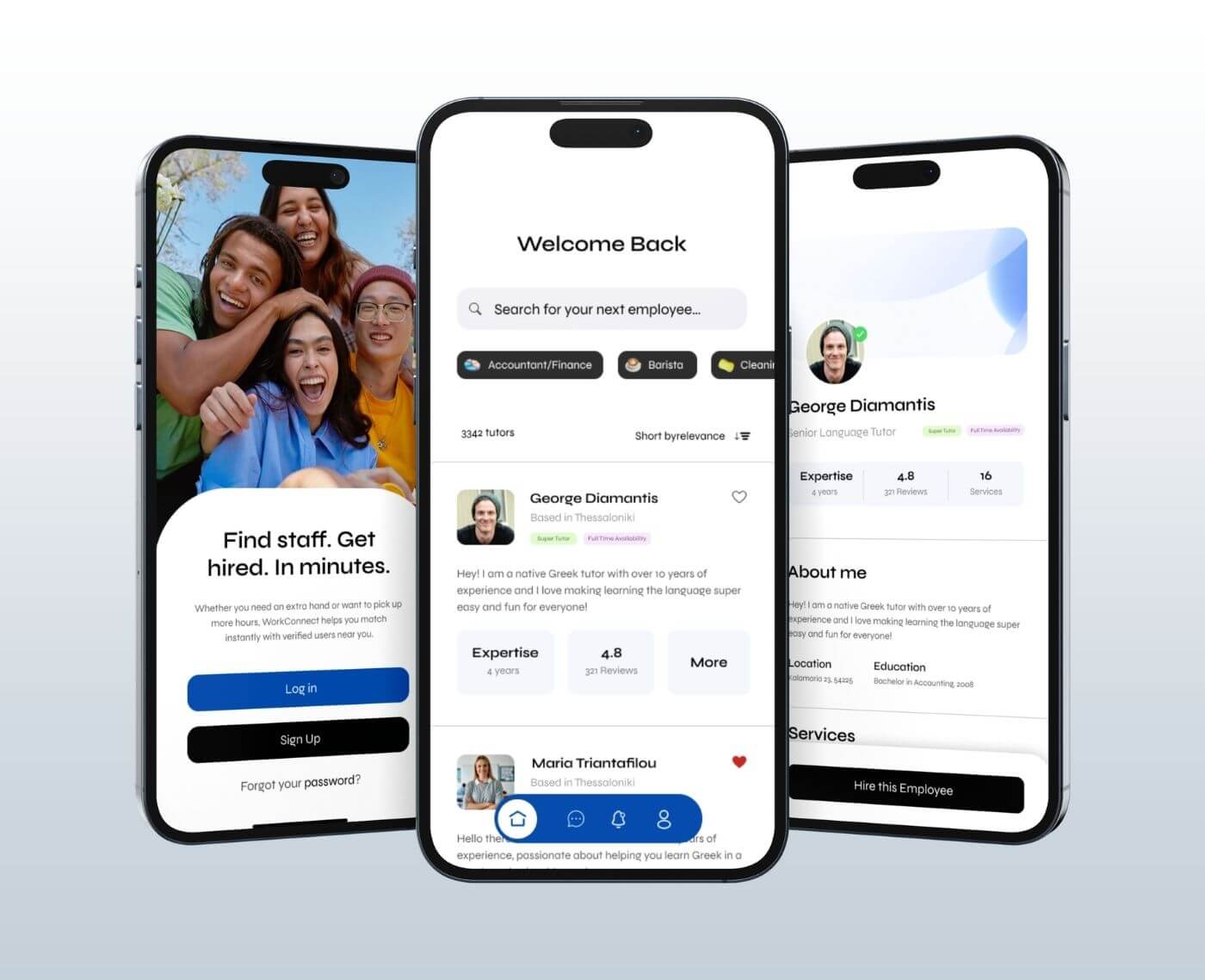
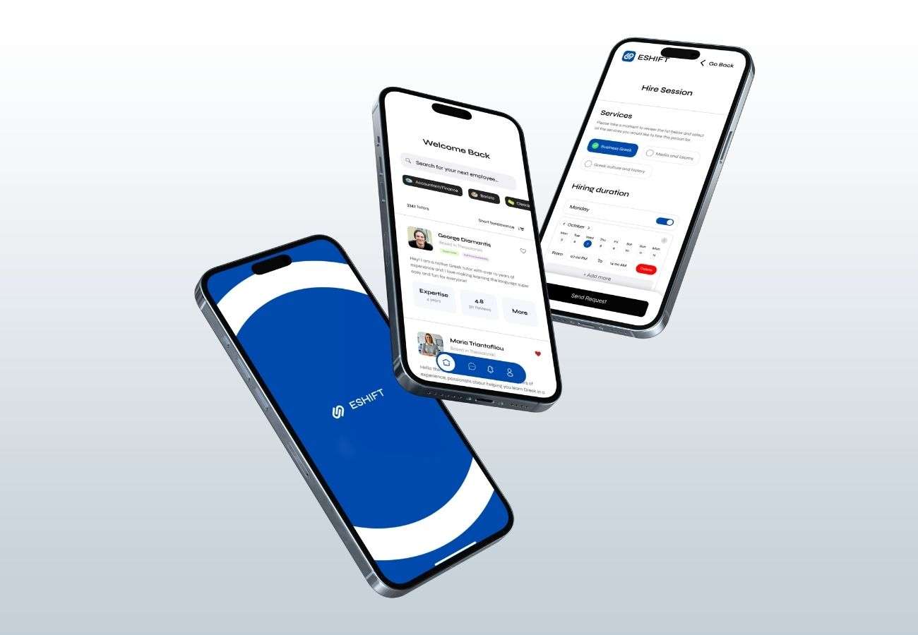
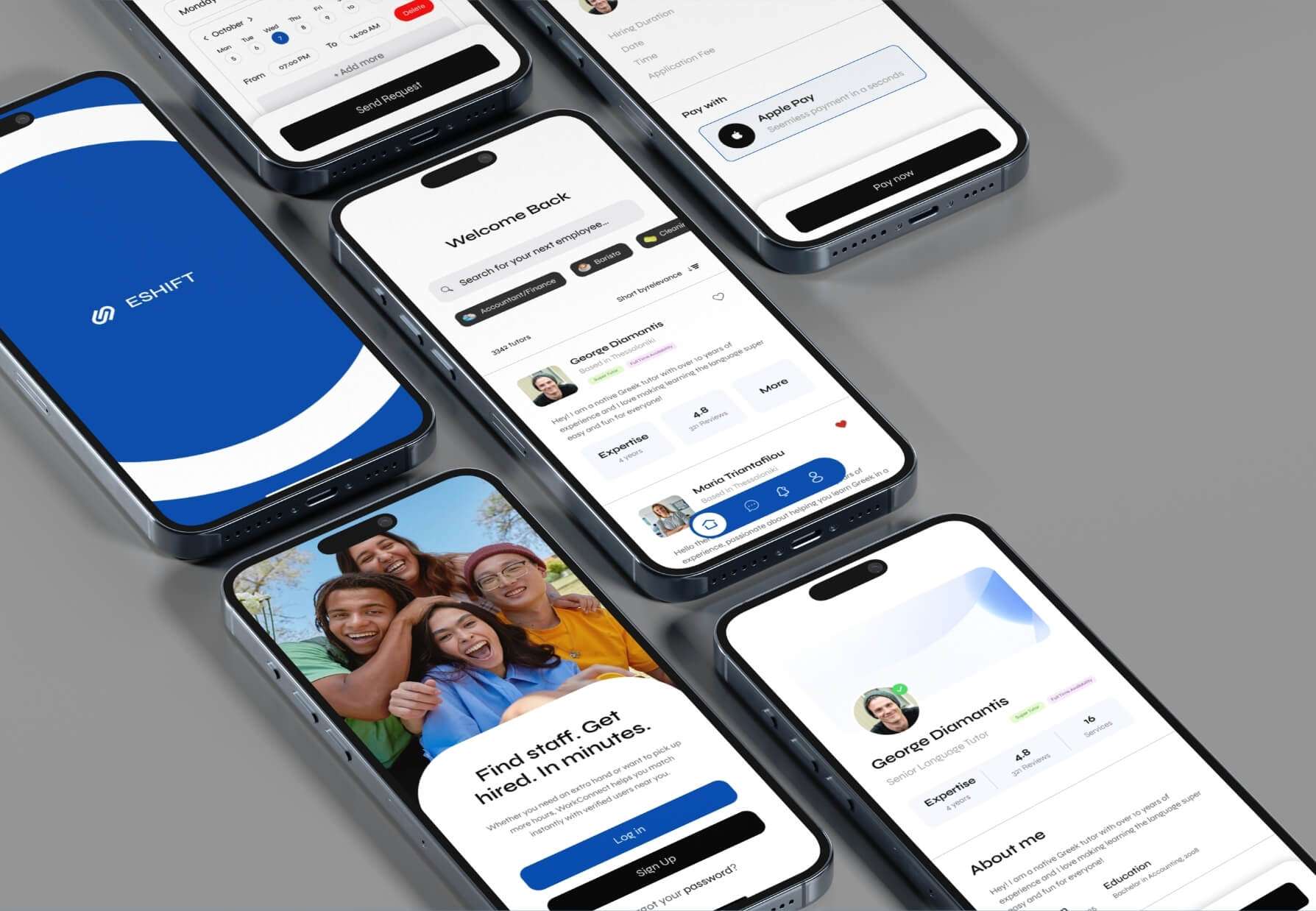
ESHIFT is a mobile platform designed to connect businesses that need short-term staff with available workers nearby. Whether a café needs an extra barista for a busy weekend or a company requires a last-minute accountant, ESHIFT enables instant, reliable matching between employers and verified workers.
The application was built with Flutter for cross-platform consistency, while the administrative dashboard was developed in WordPress for flexibility and scalability. My role as Lead UI/UX Designer was to define and execute the end-to-end design process from research and conceptualization to wireframes, prototypes, usability testing, and high-fidelity design delivery.
Responsibilities
As Lead UI/UX Designer, I oversaw the entire design process using the Design Thinking Framework.
My responsibilities included:
Conducting stakeholder interviews and translating business goals into user needs.
Structuring the information architecture for both user types.
Designing user flows and low-fidelity wireframes.
Creating high-fidelity mockups in Figma.
Overseeing usability testing sessions with our junior and intern designers.
Preparing developer handoff assets and interaction guidelines.
The problem
Small businesses and service providers often face difficulties finding short-term staff quickly. Posting on job boards or social media is slow and unreliable, while workers looking for quick shifts rarely find transparent, verified opportunities.
ESHIFT set out to solve this gap offering a trusted, immediate connection between businesses and available staff, with built-in scheduling, communication, and review systems to ensure reliability on both sides.
The goals
The project’s key goals were to:
Enable instant matching between businesses and verified workers.
Simplify the process of posting, applying, and confirming short-term jobs.
Ensure trust and transparency through profile verification and rating systems.
Create a seamless experience for both roles (employers and workers).
Provide in-app communication and payment handling to finalize agreements efficiently.
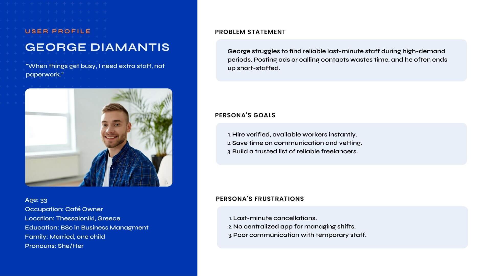
Understanding the Users
Our research identified two main user types:
Employers – small business owners, HR managers, or team leaders who need short-term employees.
Workers – freelancers, part-time staff, or students seeking flexible short-term shifts.
Both groups valued speed, reliability, and trust, but their motivations and frustrations differed significantly.
User Research Summary
To validate assumptions, we conducted a small field study with 12 participants (6 employers and 6 workers). Employers emphasized that traditional hiring was too slow and communication channels were unreliable. Workers mentioned that temporary work lacked stability and fairness, and they often encountered unclear job terms.
Key Research Findings:
Both sides wanted verified profiles to build trust.
Employers prioritized availability and proximity over long resumes.
Workers valued transparency and ratings to avoid unreliable employers.
Both wanted to avoid the complexity of traditional hiring processes.
User Research Pain Points
Employers:
Couldn’t find available staff quickly.
Frustrated by unreliable responses or no-shows.
No centralized place to manage short-term hiring.
Workers:
Unclear pay rates and job expectations.
Difficulty finding trusted, legitimate short-term gigs.
Lack of visibility into scheduling or double bookings.
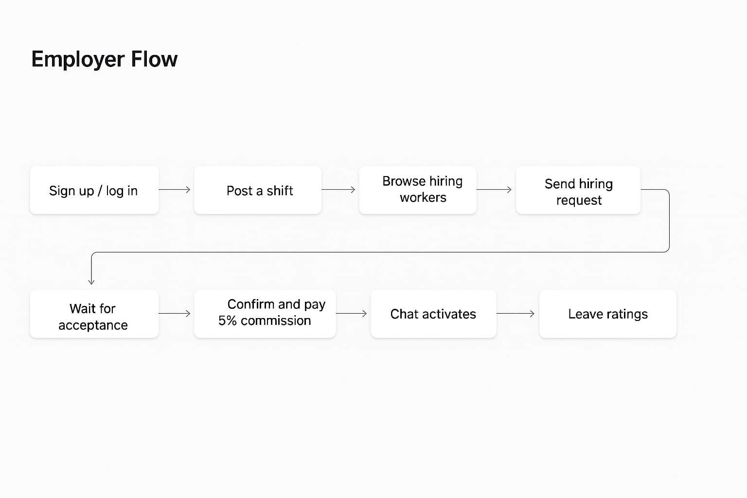
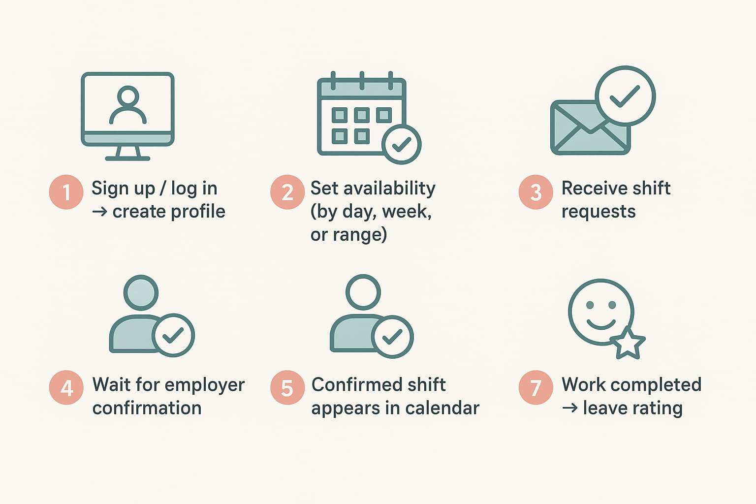
Worker Flow
Field Study / Competitor Analysis
We examined three direct competitors operating in similar spaces: Jobandtalent, JobStack, and Instawork. All offered on-demand staffing but lacked key differentiators ESHIFT aimed to provide such as calendar-based availability management, localized matching, and two-way rating systems.
| Competitor | Instant Matching | Calendar Availability | Local Filtering | 2-Way Ratings | In-App Payments |
|---|
| Jobandtalent | Yes | No | Yes | No | Yes |
| JobStack | Partial | No | Yes | No | Yes |
| Instawork | Yes | Partial | Yes | No | Yes |
| ESHIFT | Yes | Yes | Yes | Yes | Yes |
This analysis helped us identify opportunities to emphasize trust, speed, and ease of use as our core value pillars.
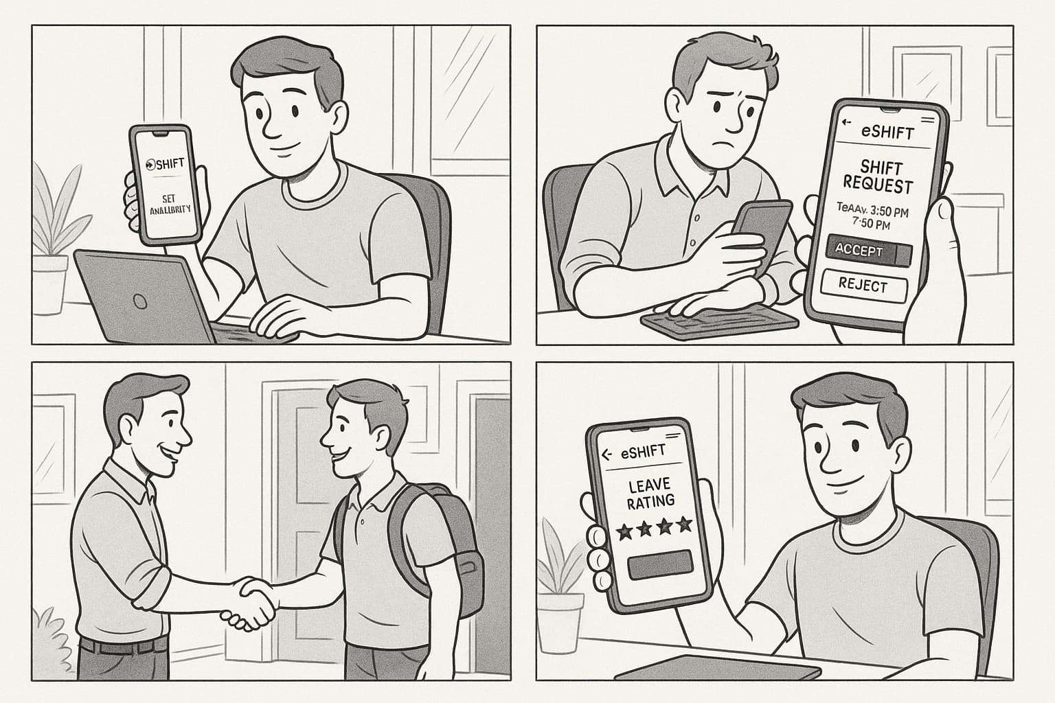
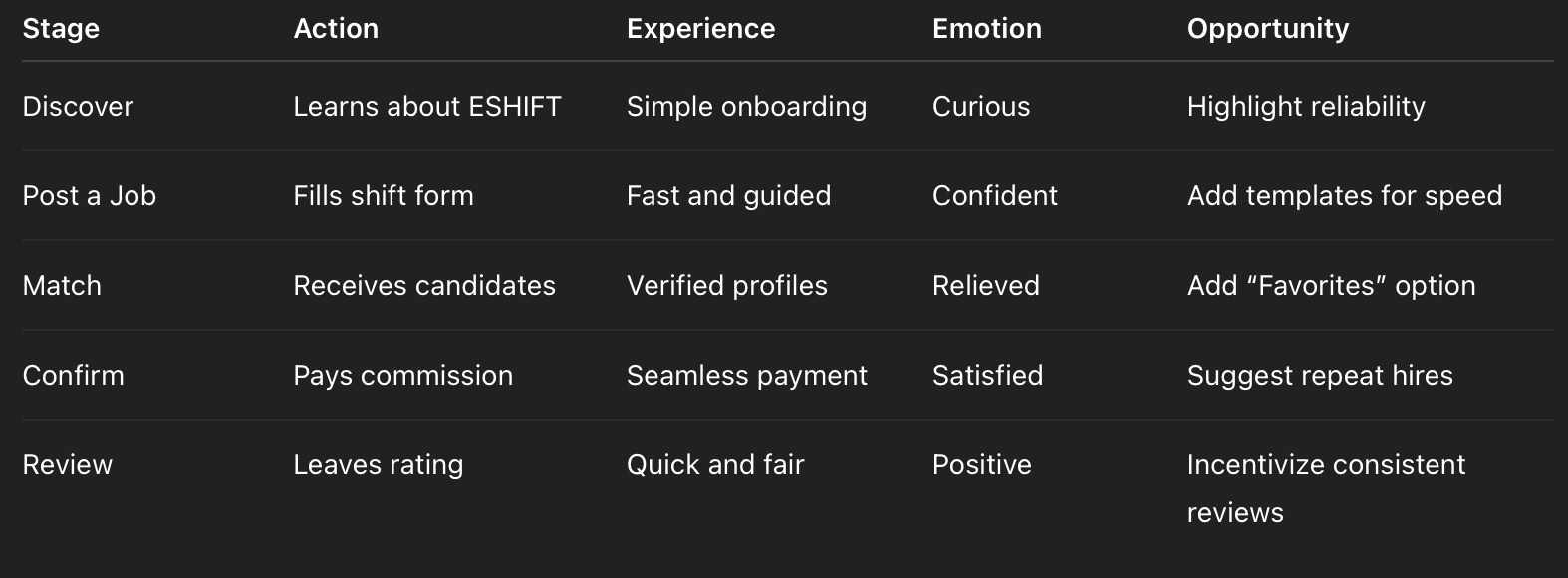
User Journey Map Insights
The user flow was designed around speed and clarity — both users needed to complete tasks in under 3 minutes.
Starting the Design — Low-Fidelity Wireframes
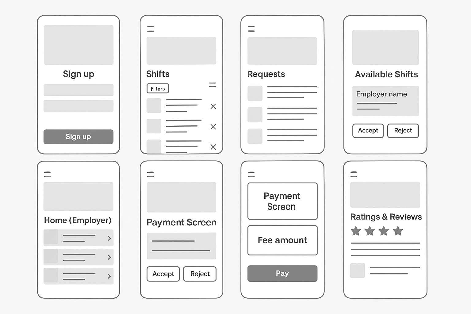
We started with hand-drawn sketches that focused on core flows posting a shift, browsing workers, and confirming matches. These were then translated into low-fidelity digital wireframes to visualize navigation and screen hierarchy before moving to detailed UI. The goal was clarity and speed: minimal taps, consistent button placement, and predictable interactions.
Usability Study: Findings
Round 1 Findings
Conducted with 5 participants using clickable low-fidelity prototypes.
Users found the “availability calendar” intuitive but wanted clearer feedback when adding bulk dates.
Employers requested filters for “experience level” and “hourly vs daily rate.”
The “confirmation step” needed clearer status messaging.
Round 2 Findings
Using the high-fidelity prototype:
Users appreciated the visual consistency between Android and iOS.
The addition of a “pending / confirmed” status improved task clarity.
Simplifying the chat entry point increased engagement.
Both sides found the final flow “smooth and predictable.”
High-Fidelity Prototype
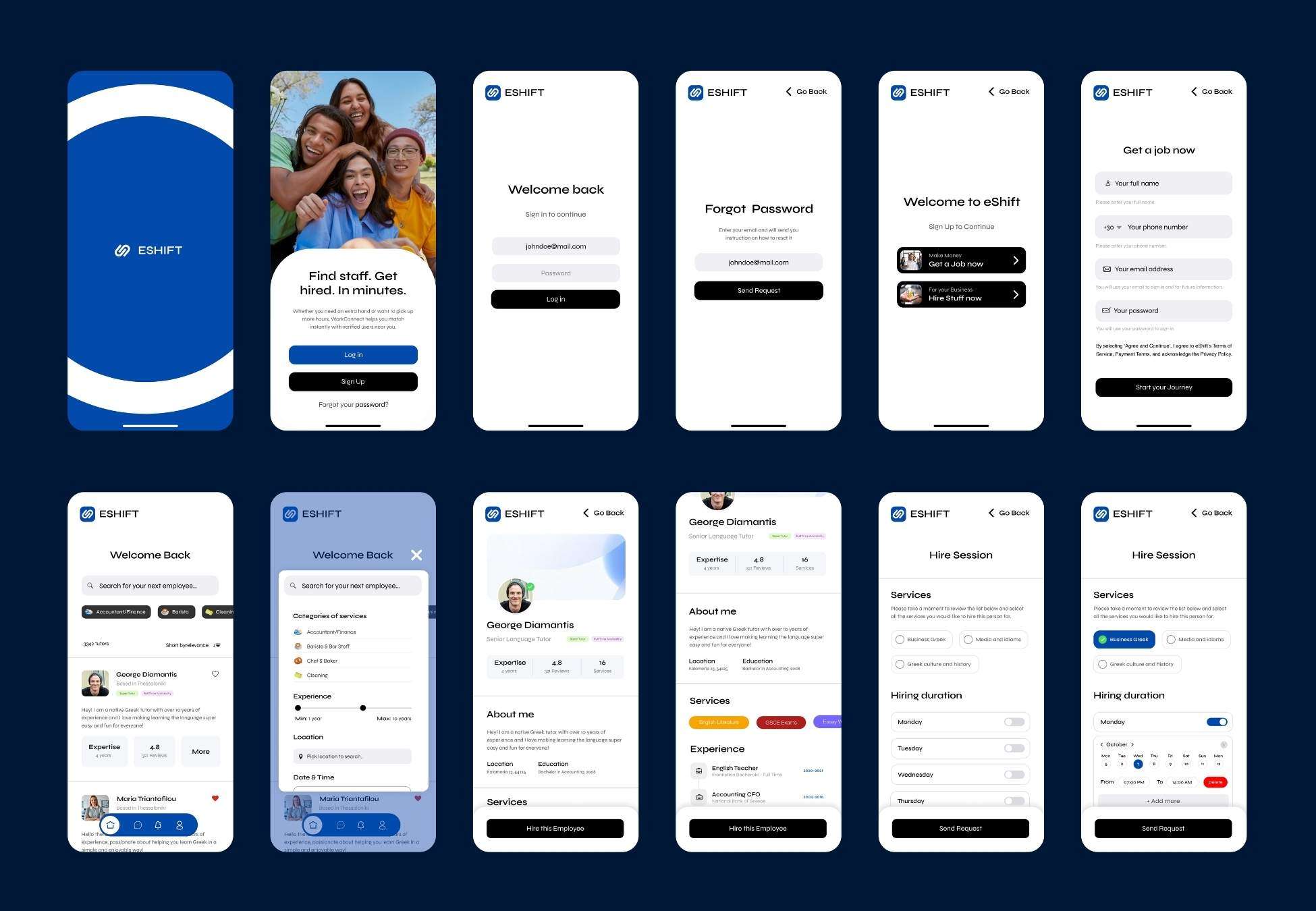
The final prototype was designed in Figma, with a visual style balancing trust and professionalism.
Color palette: neutral whites and greys with strong blue accents for CTAs.
Typography: clean, geometric sans-serif for clarity and accessibility.
Interactive elements were tested on both light and dark backgrounds to ensure legibility across devices.
All key interactions from availability input to in-app payments were prototyped and handed off to developers with design tokens for Flutter.
Accessibility Considerations
Minimum contrast ratio of 4.5:1 across all text.
All buttons include descriptive ARIA labels for screen readers.
Color was never the only indicator for status.
Calendar interactions were tested for touch accessibility on small screens.
Logical navigation order ensures easy use with assistive technologies.
Going Forward — Takeaways & Impact
ESHIFT redefined how short-term hiring could work for small businesses.
By focusing on trust, speed, and simplicity, we helped create a tool that feels human, not transactional.
From a design perspective, the biggest achievement was balancing two different user experiences (employer and worker) within one consistent interface — without overwhelming either side.
Our final usability scores improved by 42% compared to the first prototype, and users described the experience as “fast, clear, and reliable.”
Next Steps
Expand user testing with real shift scenarios once the app launches.
Integrate multilingual support (Greek / English).
Add a feature for “repeat hires” and “favorites.”
Refine accessibility for large-text and high-contrast modes.
Prepare web-based admin analytics for usage tracking.